
2025
Envizom AI
A city-scale environmental AI concept for Oizom Instruments. I storyboarded, designed and animated the 2:11 pitch film in 10 days.
Motion Graphics
Sustainability
Storyboard, UI concept and a finished 2:11 film, solo, in 10 days
Oizom Instruments builds environmental sensors, and I had already rebuilt their monitoring platform. In June 2025 they came back with something urgent. They had a concept for a city-scale environmental AI, they were pitching investors across the UAE, and they had nothing to show. The window was 1 to 10 June. I did the storyboard, the UI concepts, the component animation and the final 2:11 film on my own, through 2 rounds of minor revisions. The film became their pitch asset and they closed their raise on the back of it.
Service
Branding & Identity
Timeline
6 Weeks
Client
Nova Ventures
Location
Falls Church, VA
Oizom was not raising money for a product. They were raising money for the belief that the product could exist. That is a credibility problem, not a design one.

Problem
Envizom AI did not exist yet. It had to look like it was already running a city.
No product, no data, 10 days. Oizom is a seed-stage hardware company that was pitching well above its weight class. There was no build to film, no deployment to point a camera at, and no real city data to visualise. Everything on screen had to be constructed from scratch and still behave like a system with history.
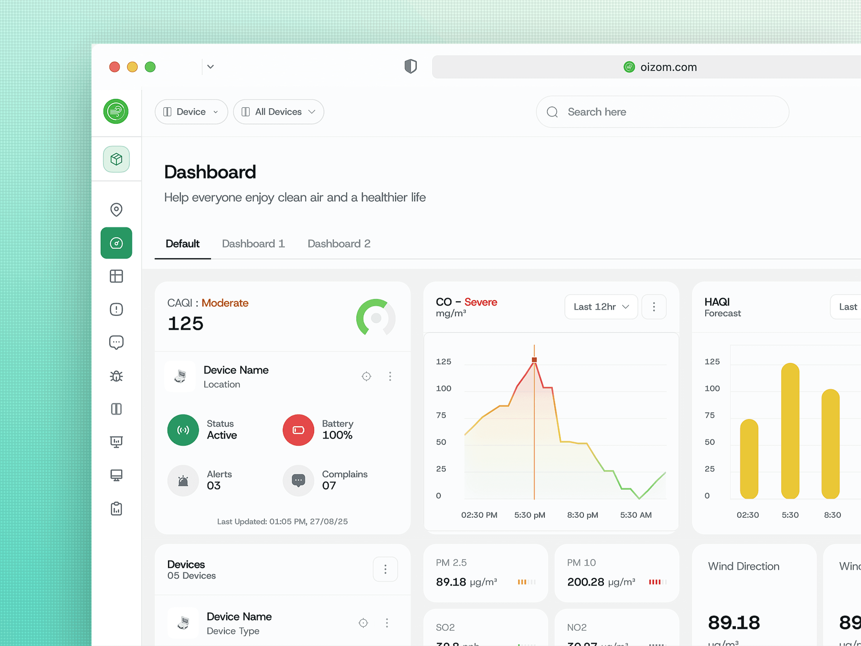
Their real platform would have hurt them. Oizom already has a working monitoring dashboard, and showing it would have told investors precisely what the company was rather than what it was betting on becoming. That gap was the whole pitch, so the film had to live entirely on the far side of it.
Anything that read as a mockup would have lost the room. The moment an investor starts wondering whether something is buildable, the conversation has moved off the opportunity and onto the risk. The work had to close that question before it got asked.


Solution
Do not show screens. Show one problem being detected, explained, assigned and resolved.
I rejected the brief as it was written. Oizom asked for a video and a few UI concepts to cut into it. I built 7 connected frames that run as a single arc instead: ambient monitoring, alert, cause, plan, dispatch. Loose hero frames would have proved the product looks good. Only a chain of consequences proves it works, and proving it works was the actual job.
The ambient layer turns off when an alert fires. In the resting state the AQI gradient floods the terrain itself, so pollution reads as a condition of the city rather than a chart laid over it. The moment an incident triggers, that colour drops to neutral and the alert is the only saturated thing on screen. Two competing reds would have cost the viewer a second, and in a 2:11 film there are no spare seconds.
The analysis names buildings. Arenco at 43 percent, Palm Beach Towers at 26 percent. Naming a source is the difference between a monitoring product and an accountability product, and accountability is what a municipality signs for.

Concept
Air spreads across an area. Noise radiates from a point. The map has to know the difference.
Each layer gets its own physics. Air quality floods the ground as a continuous field. Noise pulses outward in rings from each source. Reusing one heatmap for both would have been faster and wrong, and anyone in the room who works with this data would have caught it in a second.
You can hear the noise layer. One control plays back the reading, so a decision-maker experiences 91 dB instead of reading it. Numbers argue. Sound does not need to.
The system holds the government org chart. 7 departments, each with a direct call and message action, because an alert that reaches nobody is a notification, not an intervention.
The last frame is 3 people with phone numbers. No map, no gradient, no city. Names, numbers, and a live sending status next to each one. Every environmental tool can tell you the air is bad. The one that gets funded is the one that can tell you who has already been told.

More Works
(NK® — 02)
©2024

FAQ
01
What does a project look like?
02
How is the pricing structure?
03
Are all projects fixed scope?
04
What is the ROI?
05
How do we measure success?
06
What do I need to get started?
07
How easy is it to edit for beginners?
08
Do I need to know how to code?
2025
Envizom AI
A city-scale environmental AI concept for Oizom Instruments. I storyboarded, designed and animated the 2:11 pitch film in 10 days.
Motion Graphics
Sustainability
Storyboard, UI concept and a finished 2:11 film, solo, in 10 days
Oizom Instruments builds environmental sensors, and I had already rebuilt their monitoring platform. In June 2025 they came back with something urgent. They had a concept for a city-scale environmental AI, they were pitching investors across the UAE, and they had nothing to show. The window was 1 to 10 June. I did the storyboard, the UI concepts, the component animation and the final 2:11 film on my own, through 2 rounds of minor revisions. The film became their pitch asset and they closed their raise on the back of it.
Service
Branding & Identity
Timeline
6 Weeks
Client
Nova Ventures
Location
Falls Church, VA
Oizom was not raising money for a product. They were raising money for the belief that the product could exist. That is a credibility problem, not a design one.
Problem
Envizom AI did not exist yet. It had to look like it was already running a city.
No product, no data, 10 days. Oizom is a seed-stage hardware company that was pitching well above its weight class. There was no build to film, no deployment to point a camera at, and no real city data to visualise. Everything on screen had to be constructed from scratch and still behave like a system with history.
Their real platform would have hurt them. Oizom already has a working monitoring dashboard, and showing it would have told investors precisely what the company was rather than what it was betting on becoming. That gap was the whole pitch, so the film had to live entirely on the far side of it.
Anything that read as a mockup would have lost the room. The moment an investor starts wondering whether something is buildable, the conversation has moved off the opportunity and onto the risk. The work had to close that question before it got asked.
Solution
Do not show screens. Show one problem being detected, explained, assigned and resolved.
I rejected the brief as it was written. Oizom asked for a video and a few UI concepts to cut into it. I built 7 connected frames that run as a single arc instead: ambient monitoring, alert, cause, plan, dispatch. Loose hero frames would have proved the product looks good. Only a chain of consequences proves it works, and proving it works was the actual job.
The ambient layer turns off when an alert fires. In the resting state the AQI gradient floods the terrain itself, so pollution reads as a condition of the city rather than a chart laid over it. The moment an incident triggers, that colour drops to neutral and the alert is the only saturated thing on screen. Two competing reds would have cost the viewer a second, and in a 2:11 film there are no spare seconds.
The analysis names buildings. Arenco at 43 percent, Palm Beach Towers at 26 percent. Naming a source is the difference between a monitoring product and an accountability product, and accountability is what a municipality signs for.
Concept
Air spreads across an area. Noise radiates from a point. The map has to know the difference.
Each layer gets its own physics. Air quality floods the ground as a continuous field. Noise pulses outward in rings from each source. Reusing one heatmap for both would have been faster and wrong, and anyone in the room who works with this data would have caught it in a second.
You can hear the noise layer. One control plays back the reading, so a decision-maker experiences 91 dB instead of reading it. Numbers argue. Sound does not need to.
The system holds the government org chart. 7 departments, each with a direct call and message action, because an alert that reaches nobody is a notification, not an intervention.
The last frame is 3 people with phone numbers. No map, no gradient, no city. Names, numbers, and a live sending status next to each one. Every environmental tool can tell you the air is bad. The one that gets funded is the one that can tell you who has already been told.
More Works
(NK® — 02)
©2024
FAQ
01
What does a project look like?
02
How is the pricing structure?
03
Are all projects fixed scope?
04
What is the ROI?
05
How do we measure success?
06
What do I need to get started?
07
How easy is it to edit for beginners?
08
Do I need to know how to code?
2025
Envizom AI
A city-scale environmental AI concept for Oizom Instruments. I storyboarded, designed and animated the 2:11 pitch film in 10 days.
Motion Graphics
Sustainability
Storyboard, UI concept and a finished 2:11 film, solo, in 10 days
Oizom Instruments builds environmental sensors, and I had already rebuilt their monitoring platform. In June 2025 they came back with something urgent. They had a concept for a city-scale environmental AI, they were pitching investors across the UAE, and they had nothing to show. The window was 1 to 10 June. I did the storyboard, the UI concepts, the component animation and the final 2:11 film on my own, through 2 rounds of minor revisions. The film became their pitch asset and they closed their raise on the back of it.
Service
Branding & Identity
Timeline
6 Weeks
Client
Nova Ventures
Location
Falls Church, VA
Oizom was not raising money for a product. They were raising money for the belief that the product could exist. That is a credibility problem, not a design one.
Problem
Envizom AI did not exist yet. It had to look like it was already running a city.
No product, no data, 10 days. Oizom is a seed-stage hardware company that was pitching well above its weight class. There was no build to film, no deployment to point a camera at, and no real city data to visualise. Everything on screen had to be constructed from scratch and still behave like a system with history.
Their real platform would have hurt them. Oizom already has a working monitoring dashboard, and showing it would have told investors precisely what the company was rather than what it was betting on becoming. That gap was the whole pitch, so the film had to live entirely on the far side of it.
Anything that read as a mockup would have lost the room. The moment an investor starts wondering whether something is buildable, the conversation has moved off the opportunity and onto the risk. The work had to close that question before it got asked.
Solution
Do not show screens. Show one problem being detected, explained, assigned and resolved.
I rejected the brief as it was written. Oizom asked for a video and a few UI concepts to cut into it. I built 7 connected frames that run as a single arc instead: ambient monitoring, alert, cause, plan, dispatch. Loose hero frames would have proved the product looks good. Only a chain of consequences proves it works, and proving it works was the actual job.
The ambient layer turns off when an alert fires. In the resting state the AQI gradient floods the terrain itself, so pollution reads as a condition of the city rather than a chart laid over it. The moment an incident triggers, that colour drops to neutral and the alert is the only saturated thing on screen. Two competing reds would have cost the viewer a second, and in a 2:11 film there are no spare seconds.
The analysis names buildings. Arenco at 43 percent, Palm Beach Towers at 26 percent. Naming a source is the difference between a monitoring product and an accountability product, and accountability is what a municipality signs for.
Concept
Air spreads across an area. Noise radiates from a point. The map has to know the difference.
Each layer gets its own physics. Air quality floods the ground as a continuous field. Noise pulses outward in rings from each source. Reusing one heatmap for both would have been faster and wrong, and anyone in the room who works with this data would have caught it in a second.
You can hear the noise layer. One control plays back the reading, so a decision-maker experiences 91 dB instead of reading it. Numbers argue. Sound does not need to.
The system holds the government org chart. 7 departments, each with a direct call and message action, because an alert that reaches nobody is a notification, not an intervention.
The last frame is 3 people with phone numbers. No map, no gradient, no city. Names, numbers, and a live sending status next to each one. Every environmental tool can tell you the air is bad. The one that gets funded is the one that can tell you who has already been told.
More Works
©2024
FAQ
What does a project look like?
How is the pricing structure?
Are all projects fixed scope?
What is the ROI?
How do we measure success?
What do I need to get started?
How easy is it to edit for beginners?
Do I need to know how to code?