
2025
Oizom Air Quality Platform
A full platform redesign for air quality monitoring: 12 modules, 3 personas, and a design system built from raw tokens up.
Enterprise
Design System
Know More
The hardware was good. The software was the reason people struggled to trust what it told them.
12 modules, 3 personas, 1 design system, sole designer
Oizom builds air quality monitoring hardware deployed across multiple countries. Devices measuring particulate matter, gases, noise and weather in real time, feeding software that people actually live in.
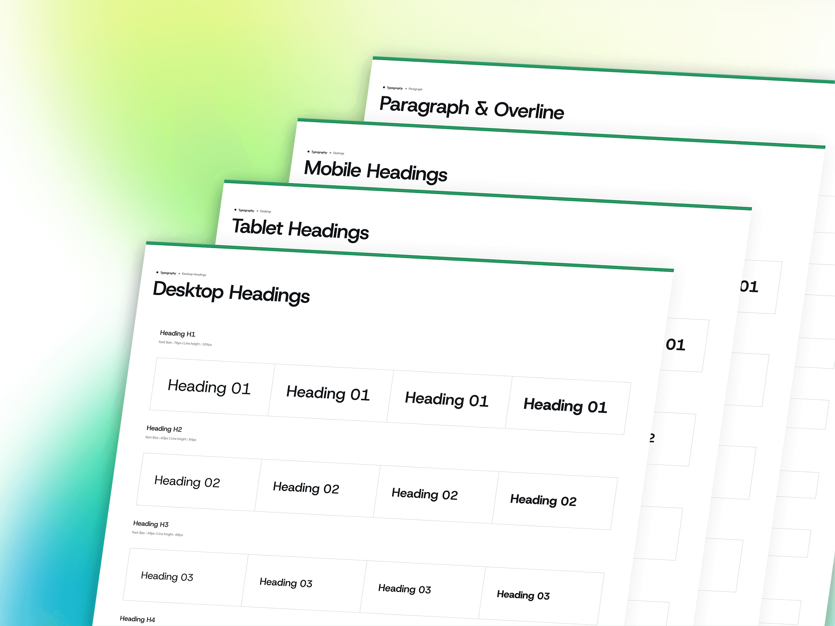
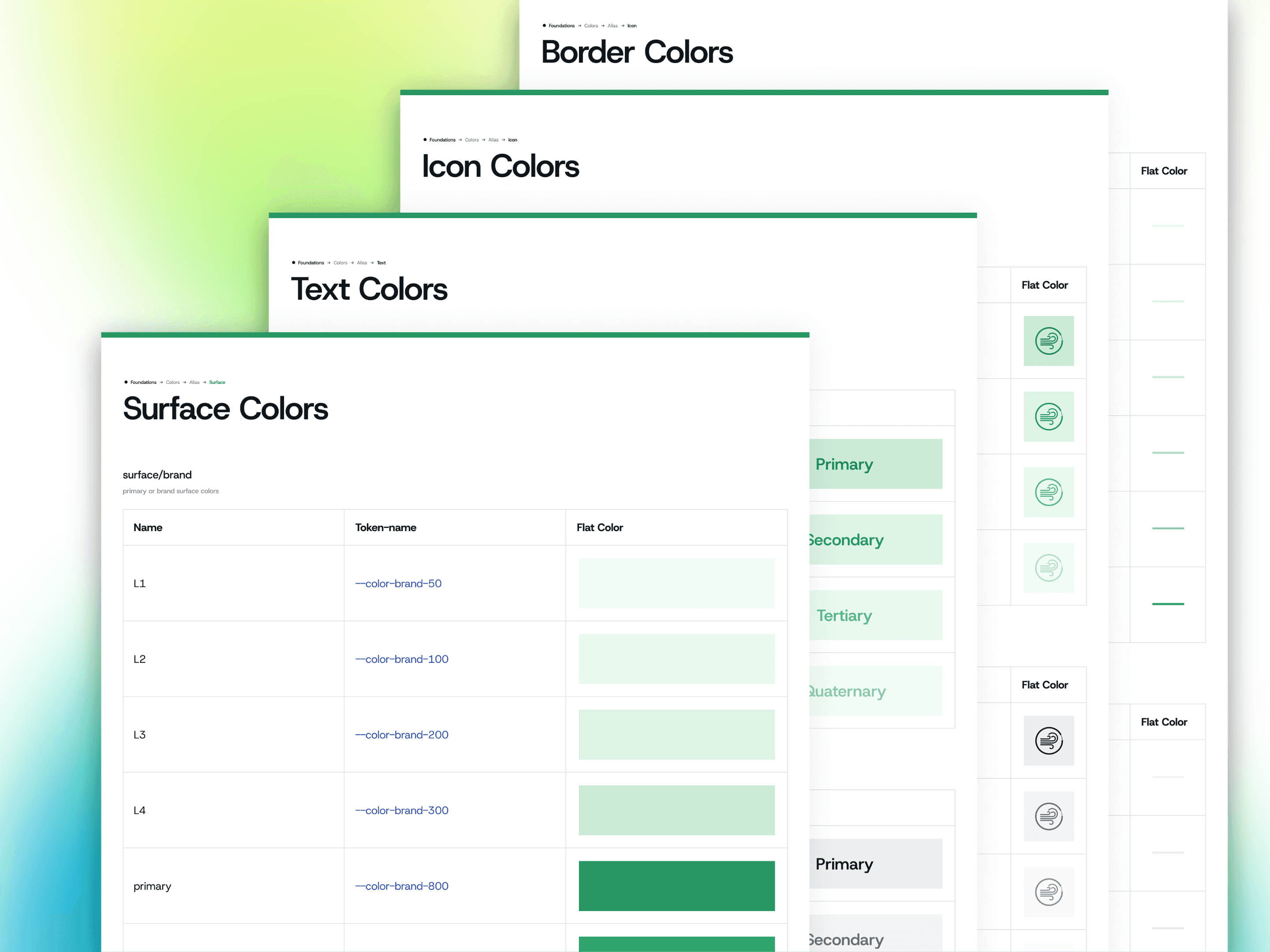
They came to me to fix the experience. It became a full platform redesign: 12 modules, a design system built from scratch at token level, a white-label theming layer so resellers could ship it under their own brand, and light and dark modes across everything. I was the only designer on the project, and the system now lives in their codebase.
Problem
Three problems stacked on top of each other, and each one made the others harder to solve.
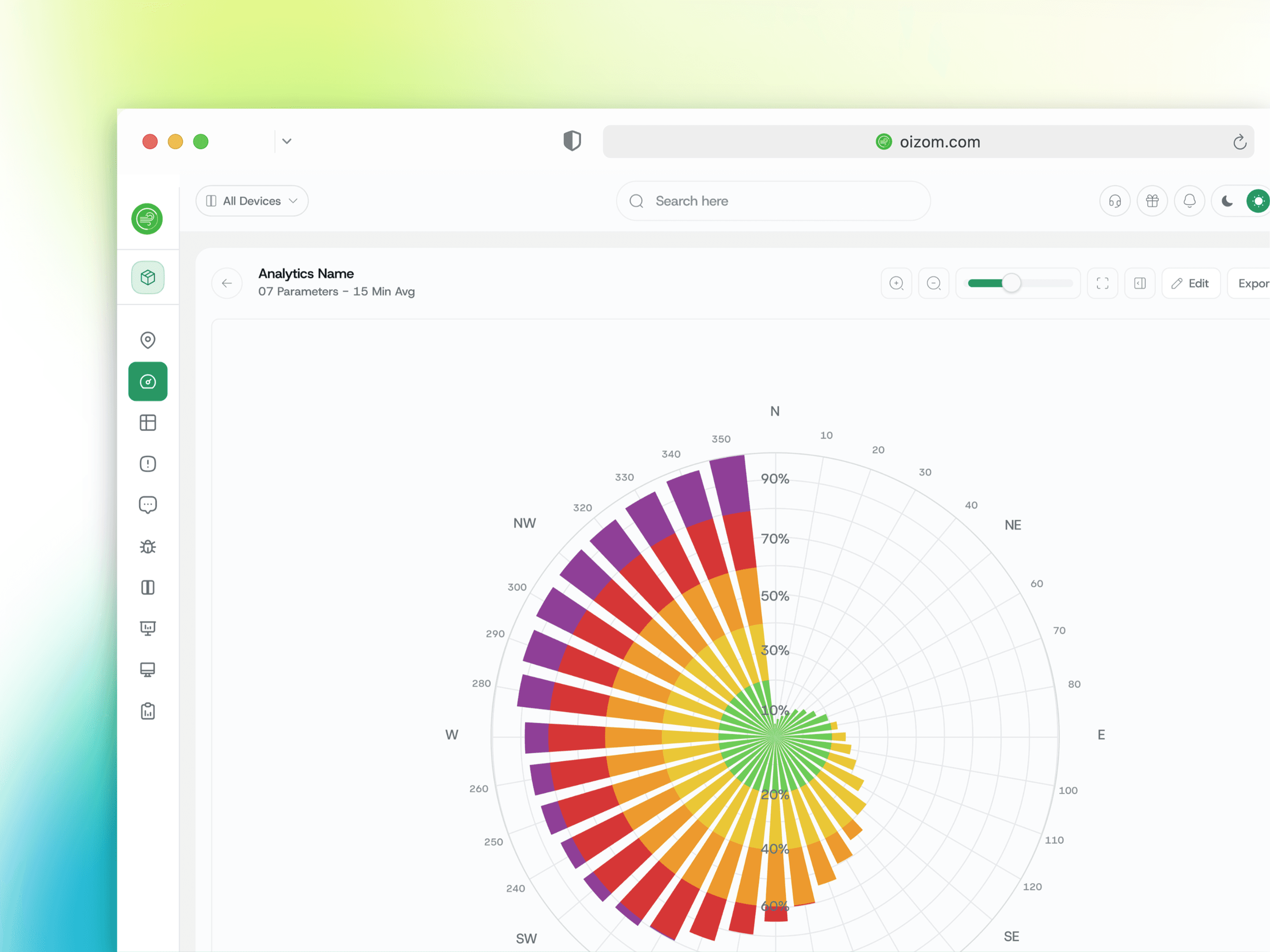
It had to be scientific-grade. This data reaches compliance reports and government submissions. The interface cannot round, simplify or lose meaning.
It had to serve three personas at once. A super admin managing 12 client accounts, a project admin running one deployment, and an end customer who wants to know if the air outside their building is safe. Three altitudes, three vocabularies, three tolerances for complexity.
It had to be white-labelled. A reseller applies their own logo, brand colour and theme. That single requirement rules out every shortcut, because nothing can be hardcoded.
Underneath all three, the existing experience was failing. Four table views with overlapping names showing the same data. A complaint form the client compared to sitting a government exam. Three filter options against thousands of rows. And AQI colours applied directly to numbers, putting yellow text on white at roughly 1.5:1 contrast on a product where a misread value has health consequences.
Solution
Most of what was broken was not visual. It was structural mismatch between a task and the shape it was given.
I audited the old software screen by screen, asking not whether it looked dated but why a page was a page and why flagging one bad reading required a form. Three decisions came out of that and carried the project.
Move the colour, do not change it. AQI colours are regulatory and I could not adjust them. So the number returned to default text colour and the band moved to a small swatch beside it. Both encodings survive, and a table can now show 90 coloured indicators and still read as calm.
Container weight matches task weight. Complaints got a modal because raising one should feel light and frequent. Analytics got a page because the configuration is interdependent and needs to be seen whole. Alerts got a stepped modal because the three questions are sequential. Same principle, three different answers.
Cell height as a parameter, not a redesign. One table design serves four modules. Reports and alerts run comfortable because they are scanned. Data validation and complaints run dense because they are worked row by row. Four modules from one component.
Concept
A system deep enough that the product reshapes itself per role, per brand and per region without forking.
Nine AQI standards ship live. India, US, Europe, Canada, GCC, Bangladesh, Indonesia and Oizom's own, differing in band count, breakpoints, averaging period and colour. A single project can run four standards at once across four device types, because a multinational client reports to several regulators.
A calculation playground to test them. Custom indices are powerful and dangerous. So sliders per pollutant, scenario presets, live results, and the actual interpolation arithmetic rendered on screen with the current numbers in it. Letting users define a scientific index is only responsible if they can check their work first.
Conditional filtering, which did not exist. Nested condition groups with drag-to-reorder, operators typed to the data, and Newest to Oldest on dates where Low to High sits on measurements.
Right-click flagging in the cell. Validation used to mean opening a form per bad reading. Eight flag states distinguishing Maintenance from Calibration from Out of range, plus bulk flagging with every row still individually editable.
Two panel archetypes covering a dozen contexts, with prev/next stepping that turns inspection from a loop into a sequence. Every one of them reappears on the map unchanged, which is what a design system is actually for.
More Works
(NK® — 02)
©2024


FAQ
01
What does a project look like?
02
How is the pricing structure?
03
Are all projects fixed scope?
04
What is the ROI?
05
How do we measure success?
06
What do I need to get started?
07
How easy is it to edit for beginners?
08
Do I need to know how to code?
2025
Oizom Air Quality Platform
A full platform redesign for air quality monitoring: 12 modules, 3 personas, and a design system built from raw tokens up.
Enterprise
Design System
Know More
The hardware was good. The software was the reason people struggled to trust what it told them.
12 modules, 3 personas, 1 design system, sole designer
Oizom builds air quality monitoring hardware deployed across multiple countries. Devices measuring particulate matter, gases, noise and weather in real time, feeding software that people actually live in.
They came to me to fix the experience. It became a full platform redesign: 12 modules, a design system built from scratch at token level, a white-label theming layer so resellers could ship it under their own brand, and light and dark modes across everything. I was the only designer on the project, and the system now lives in their codebase.
Problem
Three problems stacked on top of each other, and each one made the others harder to solve.
It had to be scientific-grade. This data reaches compliance reports and government submissions. The interface cannot round, simplify or lose meaning.
It had to serve three personas at once. A super admin managing 12 client accounts, a project admin running one deployment, and an end customer who wants to know if the air outside their building is safe. Three altitudes, three vocabularies, three tolerances for complexity.
It had to be white-labelled. A reseller applies their own logo, brand colour and theme. That single requirement rules out every shortcut, because nothing can be hardcoded.
Underneath all three, the existing experience was failing. Four table views with overlapping names showing the same data. A complaint form the client compared to sitting a government exam. Three filter options against thousands of rows. And AQI colours applied directly to numbers, putting yellow text on white at roughly 1.5:1 contrast on a product where a misread value has health consequences.
Solution
Most of what was broken was not visual. It was structural mismatch between a task and the shape it was given.
I audited the old software screen by screen, asking not whether it looked dated but why a page was a page and why flagging one bad reading required a form. Three decisions came out of that and carried the project.
Move the colour, do not change it. AQI colours are regulatory and I could not adjust them. So the number returned to default text colour and the band moved to a small swatch beside it. Both encodings survive, and a table can now show 90 coloured indicators and still read as calm.
Container weight matches task weight. Complaints got a modal because raising one should feel light and frequent. Analytics got a page because the configuration is interdependent and needs to be seen whole. Alerts got a stepped modal because the three questions are sequential. Same principle, three different answers.
Cell height as a parameter, not a redesign. One table design serves four modules. Reports and alerts run comfortable because they are scanned. Data validation and complaints run dense because they are worked row by row. Four modules from one component.
Concept
A system deep enough that the product reshapes itself per role, per brand and per region without forking.
Nine AQI standards ship live. India, US, Europe, Canada, GCC, Bangladesh, Indonesia and Oizom's own, differing in band count, breakpoints, averaging period and colour. A single project can run four standards at once across four device types, because a multinational client reports to several regulators.
A calculation playground to test them. Custom indices are powerful and dangerous. So sliders per pollutant, scenario presets, live results, and the actual interpolation arithmetic rendered on screen with the current numbers in it. Letting users define a scientific index is only responsible if they can check their work first.
Conditional filtering, which did not exist. Nested condition groups with drag-to-reorder, operators typed to the data, and Newest to Oldest on dates where Low to High sits on measurements.
Right-click flagging in the cell. Validation used to mean opening a form per bad reading. Eight flag states distinguishing Maintenance from Calibration from Out of range, plus bulk flagging with every row still individually editable.
Two panel archetypes covering a dozen contexts, with prev/next stepping that turns inspection from a loop into a sequence. Every one of them reappears on the map unchanged, which is what a design system is actually for.
More Works
(NK® — 02)
©2024
FAQ
01
What does a project look like?
02
How is the pricing structure?
03
Are all projects fixed scope?
04
What is the ROI?
05
How do we measure success?
06
What do I need to get started?
07
How easy is it to edit for beginners?
08
Do I need to know how to code?
2025
Oizom Air Quality Platform
A full platform redesign for air quality monitoring: 12 modules, 3 personas, and a design system built from raw tokens up.
Enterprise
Design System
Know More
The hardware was good. The software was the reason people struggled to trust what it told them.
12 modules, 3 personas, 1 design system, sole designer
Oizom builds air quality monitoring hardware deployed across multiple countries. Devices measuring particulate matter, gases, noise and weather in real time, feeding software that people actually live in.
They came to me to fix the experience. It became a full platform redesign: 12 modules, a design system built from scratch at token level, a white-label theming layer so resellers could ship it under their own brand, and light and dark modes across everything. I was the only designer on the project, and the system now lives in their codebase.
Problem
Three problems stacked on top of each other, and each one made the others harder to solve.
It had to be scientific-grade. This data reaches compliance reports and government submissions. The interface cannot round, simplify or lose meaning.
It had to serve three personas at once. A super admin managing 12 client accounts, a project admin running one deployment, and an end customer who wants to know if the air outside their building is safe. Three altitudes, three vocabularies, three tolerances for complexity.
It had to be white-labelled. A reseller applies their own logo, brand colour and theme. That single requirement rules out every shortcut, because nothing can be hardcoded.
Underneath all three, the existing experience was failing. Four table views with overlapping names showing the same data. A complaint form the client compared to sitting a government exam. Three filter options against thousands of rows. And AQI colours applied directly to numbers, putting yellow text on white at roughly 1.5:1 contrast on a product where a misread value has health consequences.
Solution
Most of what was broken was not visual. It was structural mismatch between a task and the shape it was given.
I audited the old software screen by screen, asking not whether it looked dated but why a page was a page and why flagging one bad reading required a form. Three decisions came out of that and carried the project.
Move the colour, do not change it. AQI colours are regulatory and I could not adjust them. So the number returned to default text colour and the band moved to a small swatch beside it. Both encodings survive, and a table can now show 90 coloured indicators and still read as calm.
Container weight matches task weight. Complaints got a modal because raising one should feel light and frequent. Analytics got a page because the configuration is interdependent and needs to be seen whole. Alerts got a stepped modal because the three questions are sequential. Same principle, three different answers.
Cell height as a parameter, not a redesign. One table design serves four modules. Reports and alerts run comfortable because they are scanned. Data validation and complaints run dense because they are worked row by row. Four modules from one component.
Concept
A system deep enough that the product reshapes itself per role, per brand and per region without forking.
Nine AQI standards ship live. India, US, Europe, Canada, GCC, Bangladesh, Indonesia and Oizom's own, differing in band count, breakpoints, averaging period and colour. A single project can run four standards at once across four device types, because a multinational client reports to several regulators.
A calculation playground to test them. Custom indices are powerful and dangerous. So sliders per pollutant, scenario presets, live results, and the actual interpolation arithmetic rendered on screen with the current numbers in it. Letting users define a scientific index is only responsible if they can check their work first.
Conditional filtering, which did not exist. Nested condition groups with drag-to-reorder, operators typed to the data, and Newest to Oldest on dates where Low to High sits on measurements.
Right-click flagging in the cell. Validation used to mean opening a form per bad reading. Eight flag states distinguishing Maintenance from Calibration from Out of range, plus bulk flagging with every row still individually editable.
Two panel archetypes covering a dozen contexts, with prev/next stepping that turns inspection from a loop into a sequence. Every one of them reappears on the map unchanged, which is what a design system is actually for.
More Works
©2024
FAQ
What does a project look like?
How is the pricing structure?
Are all projects fixed scope?
What is the ROI?
How do we measure success?
What do I need to get started?
How easy is it to edit for beginners?
Do I need to know how to code?